Line Charts
Language of Change
- Rose/Increased steadily
- Rose/increased dramatically
- Rose/increased gradually
- Plummeted to…/Plunged to…
- Hit a peak/ Peaked at…/reached a high of…
- Fluctuated within a range of…
- Fell/dropped/shrank drastically/dramatically/sharply
- remained flat / constant/unchanged / stable at…
- Dropped and then evened out at…
- Hit a low of … / bottomed out at …
- Fell and then quickly recovered
- Dipped
- Soared
- Rocketed
- was erratic
- Fell gradually/steadily
Template
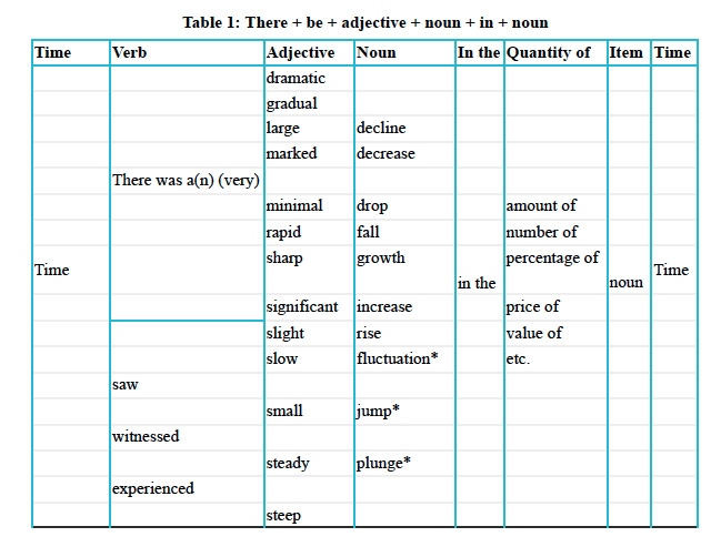
Template 1.
Time + Verb + Adjective + Noun + in the + Quantity of + Item + Time
Example:
In 1999, there was a dramatic fluctuation in the amount of rice consumed There was a sharp jump in ice-cream sales 2009 saw a sudden plunge in ice-cream sales to 20,000
Template 2.
Noun + verb + adverb
The number of …/ The price of …/ The value of … etc. +
- declined/decreased/dropped/fell/grew/increased/rose/reduced/fluctuated/jumped/remained/ +
- dramatically/drastically/gradually/markedly/rapidly/sharply/significantly/slightly/steadily/suddenly/minimally
Template 3. - Time Phrases
- From time1 to time2
- Between time1 and time2
- During the period time1 to time2
- During (month or year)
- On the date
- At (time; hours/minutes)
- (time/time1 to time2) sew/experienced/witnessed…
Template 4. - Connections
- Moving to a more detailed analysis, … / First of all, …/ To begin, …/ Following that/this, …/ Turning to the details, …/ Looking more closely at the figures, …/ In terms of…, …/ When examined more closely, …
- Subsequently, ../ Afterwards, …/ After that/this, …/ Next, …/ Over the next few years, …/ Later on, …/ By (year), …/ At this point, …/ Eventually, …/ At the end of the period, …
- Then, … / Finally, …
- In contrast, …/ However, …/ By comparison, …/ Conversely, …/ While X increased, Y declined/ Unlike X, Y remained stable. / On the other hand, …
Introducing your graph description
Two parts:
- What the graph show
- The overview
What the graph shows
- What type of graph are we describing?
- What is the information?
- How is this information measured? (i.e. millions of pounds, kg, meters, liters, etc..)
- Is there a time period?
(no copy, need to paraphrase)
The graph illustrates/shows/depicts/compares/provides information about …
Overview
We need to identify one or two main patterns of trends;
Note: don’t mention any statistical information about the graph!
Trick: You can paraphrase the “overview” and place it as a conclusion
Example
“Overall, the amount of food consumed more than doubled during the period.”
“Several trends are apparent. Firstly, the UK population are eating more and more fast food. Secondly, the type of fast food that they eat has changed.”
“Overall, several trends are apparent. Facebook’s stock price experienced a rise, Yahoo saw a decline, Google’s remained relatively stable, and Apple’s showed a fluctuating downward trend.”
“Overall the most striking feature was the strong upward trend in the numbers of books read by men. Although women read more books than man in 2011 and initially followed a similar trend to rise, but one level out in 2013 and then their reading dropped to below level of men in 2014.”
Tempalte
- Generally speaking, …
- Overall, it can be seen that …
- it is very clear from the overall trend that …
- It can be seen from the graph that …
- It is noticeable that …
- Overall it is immediately apparent that …
- The most obvious pieces of information are that …
- The most striking feature was the …
- The main facts that stand out are that …
- It is important to note that …
- The most significant facts to emerge from the graphs are that …
Bar charts
In bar charts description task, you need a well-organized answer. To keep your answer organized you must group information. Look for similarities for things that can be grouped and write about them together
Divide a list into 2~3 groups. There is commonly one group at top, one in the middle and on at the bottom.
Comparing and contrasting
Comparatives and superlatives
High - Higher - the Highest Low - Lower - the Lowest effective - more effective - the most effective productive - more productive - the most productive popular - more popular - the most popular wealthy - wealthier - the wealthiest hot - hotter - the hottest cold - colder - the coldest good - better - the best bad - worse - the worst
Transitions
- Germany consumes nearly 80 million tons of rice per year; however, it produces none.
- The UAE produces large amount of oil. In the contrast, Taiwan produces none.
- Russia consumes 184.2 million tons of gas. On the other hand, the republic of Ireland consumes just 4.2 millon per year.
Subordinating Conjunctions
- Spain produces high levels of solar power, whereas / while Japan produces almost none;
- While Germany consumes nearly 80 million tons of rice per year, it produces none.
- Although Italy produced over 6 million tons of olives, Spain produced almost double during the same period.
Bar chart analyzing
- What is the graph showing?
- What measurements are used?
- Is there a timeframe?
- What is the main trend?
- How could you group the information? (Looking for any similarities between the patterns)
- Based on your answer to number 5, how many paragraphs would you have in total?
Describing Two Graphs Simultaneously
When there are two graphs,
Tips:
- Look at the first, summarize it then move to the second and compare it
- Write about both equally
- Make an effective plan by either addressing each paragraph then comparing them or choosing crieria and then comparing both charts in each paragraph.
Strategy:
- What do they have in common?
- What is difference between them?
- What are the most interesting results and the clearest trends in each graph?
- What conclusions can you draw from both charts?
Pie Charts
- The most relevant information is usually in the biggest “portions” of the chart.
- The language of changes, the language of comparing and contrasting is the same as line chart and bar chart
Language for displaying percentages and proportions - fractions and percentage
-
80% / four-fifths
-
75% / three-quarters
-
70% / seven in ten
-
two-thirds
-
60% / three-fifths
-
55% / more than half
-
50% / half
-
45% / more than two-fifths
-
40% / two-fifths
-
35% / more than a third
-
30% / less than a third
-
25% / a quarter
-
20% / one-fifth / a fifth
-
15% / less than a fifth
-
10% / one in ten
-
5% / one in twenty
-
77% / just over three quarters
-
77% / approximately three quarters
-
49% / just under a half
-
49% / near a half
-
32% / almost a third
-
75%-85% a very large majority
-
65%-75% a significant proportions
-
10%-15% a minority
-
5% a very small number
Tables
- Detect patterns and trends from table
- Always start with the most interesting information and leave the least interesting data until the end of the descripition
Process Description
Language for describing sequences
- initially
- before
- first, firstly
- then
- after that
- next
- immediately after
- as soon as
- once
- after
- following that - after that
- when
- where
- at the same time - simultaneously
- finally
- prior to
- in turn
- subsequently
Some Essential Vocabulary for Process Description
Storage - Store Pasteurization - Pasteurize Harvest/Harvesting - Harvest Delivery - Deliver Assembly - Assemble Packing/Packaging - Pack/Package Evaporation - Evaporates Condensation - Condense Intrusion - Intruse Precipitation - Precipitate Aquifer
Describing Maps
Four-paragraph structure
- Paragraph 1 - Paraphrase Sentence
- Paragraph 2 - Overview
- Write two general sentences about the map.
- Need to write about the most important differences between both maps.
- Example:
- Over the time period, the area underwent radical changes.
- In the period between 1996 and 2006, the park was totally redesigned.
- From 2008 to 2018, the city center was subject to some important developments
- The downtown area was completely renovated and modernized during the time period.
- The city changed considerably over the period.
- During the 20-year period, the woodland area was completely transformed.
- Over the time period, the church was completely refurbished.
- Between 2007 and 2017, the old blocks of flats was renovated.
- Important questions to help you identify the main changes:
- Were the changes big or small (major or minor)?
- Were there any big improvements to the infrastructure of the area?
- How did the buildings and facilities within the area change?
- Is the area more residential than it was before or is it less residential?
- Has the number of trees increased or decreased over time?
- Paragraph 3 - Main Body
- Group information by location on map or by time.
- 4 clear and logical sentences about specific changes which occurred during the time period.
- Paragraph 4 - Main Body 2
- Like Paragraph 3
Useful change phrases for map description
replaced - took the place of… were knocked down to make way for … - when a building or wall deliberately destroyed to create space for something else were pulled down - when a building or wall destroyed especially because it was very old or dangerous were demolished to create - when a building or wall is deliberately destroyed to create space for something else was turned into - were transformed or changed into something else were chopped down - the action of cutting trees until they fall to increase the size of - generic term for: to make bigger or wider to reduced the size of - generic term for: to make smaller or narrower taking their place - occupying the place where the other thing used to be was converted into - was transformed or changed into was torn down - was knocked down
Reference
- IELTS Writing Masterclass 8.5 - Marc Roche